Vizzly

VizzlyUI Icon Set & Interface Design Support

Client: Vizzly (Hotel Social Media Management App)
Role: Icon Designer & UI Design Contributor
Deliverables: Custom Icon Library, Interface Element Design, Visual System Support

Vizzly is a hotel-focused social media management app that helps hospitality teams streamline content scheduling and performance tracking. The product team needed a consistent, intuitive visual system to support its growing platform.

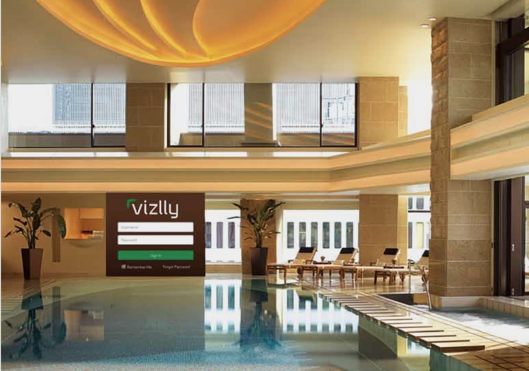
Working closely under the direction of the Lead UI Designer, I developed a bespoke icon settailored to Vizzly’s brand and user experience needs. The icons were designed to be scalable, accessible, and visually cohesive, covering functions such as login, dashboard navigation, media upload, and content metrics.
In addition to icon design, I contributed to interface layouts for key user flows—including the login screen, dashboard overview, and media upload process—ensuring the visuals were not only brand-consistent but also user-friendly and efficient.

Impact
  • Contributed to a streamlined design handoff process for development, reducing iteration time.
  • Delivered a complete, unified icon system that enhanced UI clarity and brand identity.
  • Helped improve usability through intuitive, minimal interfaces that supported Vizzly’s core features.

AHES Brand

Al Huda Elementary SchoolBranding

Client: Al Huda Elementary School
Role: Lead Designer
Deliverables: Logo Design, Visual Identity, Typography Direction, Print Collateral, Brand Videos, Messaging Strategy

Al Huda Elementary School needed a visual identity that reflected its unique blend of Islamic values and academic excellence. The objective was to design a brand system that communicated the school’s educational mission while engaging both children and parents in a meaningful, relatable way.

Logotype

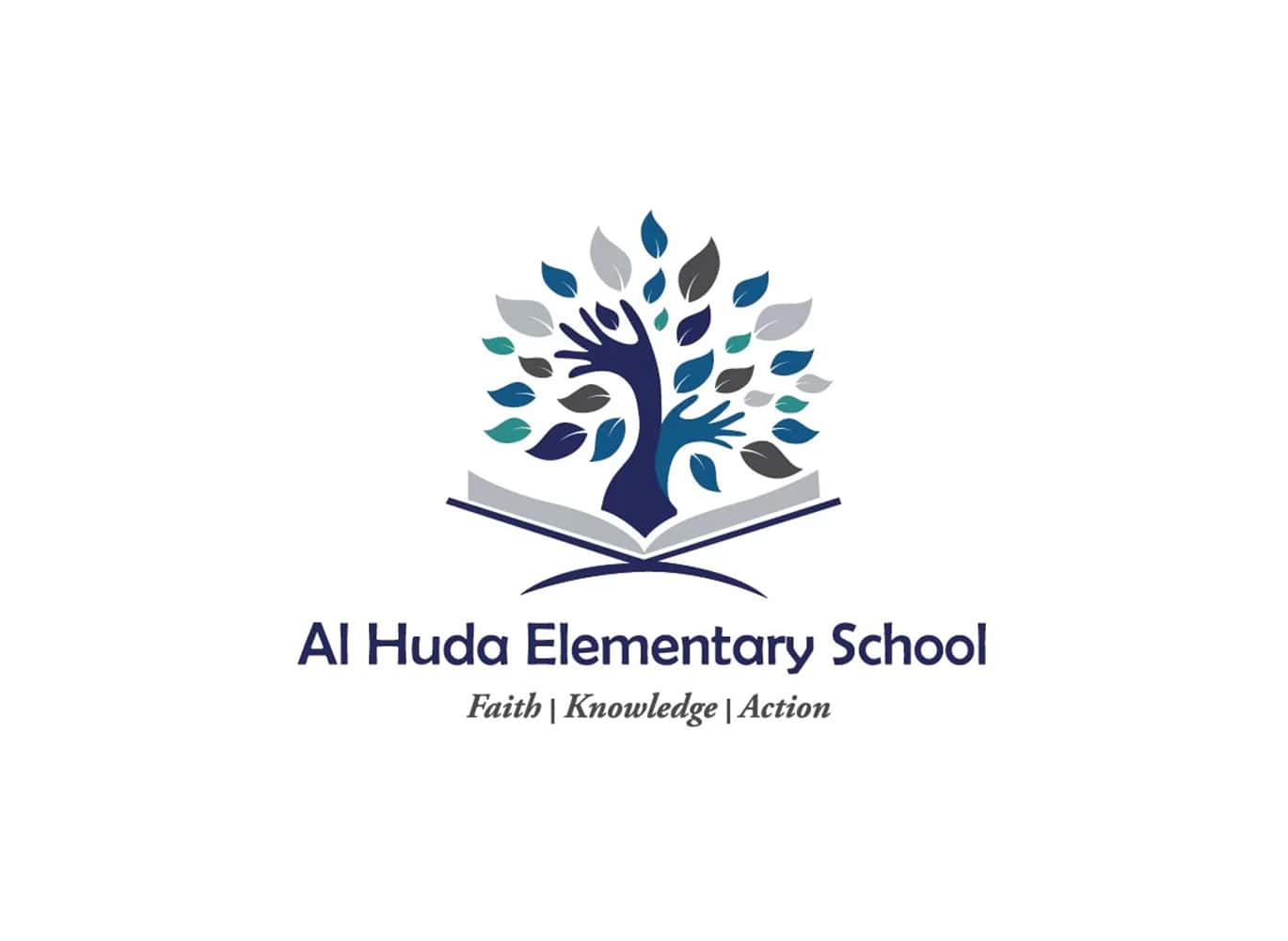
At the heart of the logo is a stylized open book, symbolizing knowledge as the foundation of learning. From this book, a tree emerges, with hand-shaped branches that represent children acting upon what they learn—growing, reaching, and giving back. Each hand sprouts a variety of leaves, symbolizing diverse, meaningful outcomes of applied learning.
The visual language is a blend of structured and whimsical:

  • The tree features curved, cartoony lines to reflect the joy and playfulness of early education.
  • The book is more sleek and refined, referencing scholarly values and discipline.
  • A custom typeface bridges the gap between the two, balancing the maturity of serif forms with the softness of sans serif to feel both credible and accessible.
Messaging-Driven Design & Video

The school’s core message, “Rooted in Faith. Diverse in Knowledge.”, was translated visually through design and extended into storytelling via two brand videos:

  • Rooted in Faith: Focused on the spiritual foundation of the school, featuring students and how Islamic values are integrated into daily life.
  • Diverse in Knowledge: Highlighted the balance of Islamic and secular education, emphasizing that students don’t fall behind academically while gaining moral grounding.
  • A third video concept—Action—was developed to feature parents and teachers discussing how faith and knowledge shape students’ behavior at home, completing the school’s philosophy. Although this video wasn’t produced, the concept helped align the creative direction of all content.
Impact & Results
  • Built a cohesive and meaningful identity system grounded in the school’s philosophy.
  • Designed and implemented brand elements across stationery, signage, and print materials, creating a unified school presence.
  • Developed a flexible colour palette and logo system scalable across grade levels and marketing channels.
  • Created engaging video content that brought the brand message to life and strengthened community connection.
  • Elevated the school’s public image, supporting enrollment efforts and outreach initiatives.

Vanta

Vanta Coffee Club & EateryBranding

Role: Brand Strategist & Lead Designer


Deliverables: Brand Identity, Logo, Website, Signage, Menu Design, Marketing Collateral, In-Store Art Direction

BlackGold Café approached me during a transitional period, seeking to evolve beyond their original identity. The owners wanted a brand that captured their growth and reintroduction into the market—something bold, modern, and conceptually rich. The challenge was to visually articulate a narrative of transformation while maintaining accessibility for a diverse, urban audience.

Creative Strategy & Process

Through collaborative discovery sessions, we developed a new name—Vanta—inspired by Vantablack, one of the darkest substances known, symbolizing depth, rebirth, and sophistication. We created a concept-driven brand system using custom “dictionary” style graphics to reimagine Vanta’s meaning throughout the café, blending storytelling into the environment.

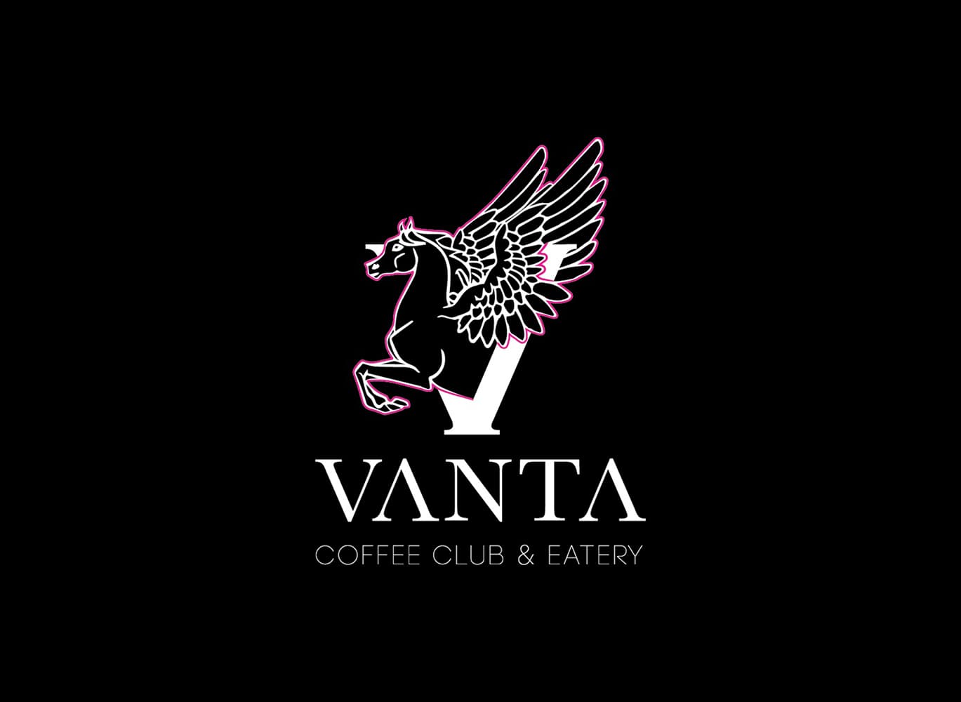
  • Logo Design: Developed a sleek, minimal wordmark rooted in balance and contrast
  • Signage & Interior: Directed installation of on-brand environmental graphics and signage
  • Menus & Print Collateral: Designed clear, typography-led layouts using the new brand palette
  • Website: Built a clean, responsive site showcasing Vanta’s story and offerings
  • Marketing: Consulted on launch strategy and designed key promotional materials
  • Cross-channel Cohesion: Ensured visual consistency across all touchpoints, from storefront to business cards

Impact & Results
  • Successfully launched the rebrand across physical and digital channels within a 3-month window
  • Helped reposition the café as a premium brand in a competitive neighborhood, drawing a 20% increase in foot traffic during the first month post-launch
  • Received strong community engagement through Instagram and in-store visuals that encouraged user-generated content and word-of-mouth referrals
  • Established a brand foundation that continues to support seasonal campaigns and expansions

YMCA

YMCA of Greater TorontoWebsite Redesign + Email Ecosystem

Role: Digital Content Marketing Specialist/Advisor

The YMCA of Greater Toronto was undergoing a major digital transformation to better engage its diverse community online. Their website and email communications were outdated, fragmented, and difficult to scale. I was brought on to help elevate the YMCA’s digital experience, leading efforts across website redesign, email marketing, microsite launches, and content management.

Homepage Redesign & Personalization Strategy

Co-Lead for UX/UI & Content Architecture

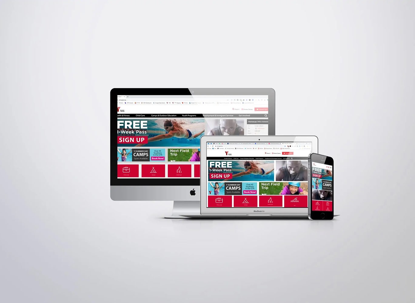
As part of a broader public website refresh, I co-led the homepage redesign. We introduced a tile-based layout to support dynamic content and structured the experience around Sitecore personalization, allowing logged-in users to see custom content based on their interests and membership status.

What I did:

  • Worked closely with a third-party dev team to implement Sitecore personalization rules
  • Proposed and implemented tile-based design for flexible content blocks
  • Led UX planning and created wireframes that prioritized mobile-first engagement
  • Built internal documentation and trained staff on using the new CMS

Content Management & Microsite Development

Main Web Publisher & Launch Partner

As the main website updater, I was responsible for keeping the YMCA’s digital content timely, accurate, and engaging across all web properties. I also spearheaded the creation of microsites for newly launched health and fitness centres, customizing content for local communities and streamlining new centre onboarding.

What I did:

  • Maintained daily content updates across the full YMCA website
  • Created and launched microsites for new locations, each with unique programming
  • Ensured all content adhered to AODA accessibility standards and brand guidelines
    Impact:
  • Kept critical public information current and community-centered
  • Improved efficiency of web publishing across teams
  • Enabled faster launches of new YMCA centres with dedicated digital hubs

Email Ecosystem Overhaul

Lead Designer + Campaign Strategist

To bring consistency and impact to YMCA’s email communications, I redesigned and deployed campaign templates using Campaign Monitor. Each email template was built for accessibility (AODA compliant), optimized for mobile, and customized for department needs while maintaining brand standards.

What I did:

  • Designed branded, modular email templates for multiple departments
  • Created automated flows and drip campaigns for memberships, events, and programming
  • Trained team members on best practices, segmentation, and reporting
  • Standardized email design across the organization for consistency and clarity
Impact:
  • Boosted open rates by 18% and improved click-through rates with clearer CTAs
  • Enabled non-design staff to deploy emails using branded templates
  • Strengthened brand identity across more than a dozen program areas

IDRF

International Development and Relief Foundation (IDRF)Brand, Campaign & Web Evolution

Role: Director of Marketing & Communications
Duration: 2019 – Present


Project Context

Over the past 5 years, I have led the transformation of IDRF’s marketing and communications strategy, evolving it into a high-performing, design-driven, and donor-first operation. As Director of Marketing & Communications, I’ve overseen creative, digital, and brand initiatives across platforms — building cohesive campaigns and systems that serve both donor needs and organizational goals.

Campaign Ecosystems: 

Ramadan, Qurbani, Emergency Appeals
Multichannel Strategy & Creative Direction

I have directed the annual execution of full-scale campaigns for Ramadan, Qurbani, and emergency relief — year after year — ensuring consistency in brand voice, impact in storytelling, and performance in ROI. These campaigns involved a 360° approach, integrating video, design, advertising, and digital infrastructure.


What I did over 5 years:

  • Oversaw concept-to-delivery execution of seasonal and emergency campaigns
  • Directed teams in creating hundreds of design assets for print, web, and social
  • Crafted and upheld campaign architecture and visual identity across 12+ program countries
  • Managed six-figure advertising budgets, ensuring 10%+ ROI annually
Impact:
  • Increased Ramadan revenue by 30%+ year-over-year
  • Delivered consistent donor engagement growth and retention
  • Elevated IDRF’s brand perception through intentional, human-centered campaigns

Website Redesign & Optimization

Led Three Iterative Redesigns for Performance & Brand

Over the course of 5 years, I led three major redesigns of the IDRF website to support our evolving donor strategy and marketing goals. With each redesign, I focused on improving user experience, visual clarity, and alignment with key campaigns.

What I did:

  • Directed creative and technical teams to align UX with donor behaviour and SEO
  • Built scalable landing page systems for urgent appeals and country-specific asks
  • Implemented donation funnel optimizations using data-driven testing
  • Continually refined content hierarchy to guide users with clarity and purpose
Impact:
  • Boosted conversion rate by 42%
  • Reduced bounce rates by 19%
  • Created a modular site design that supports fast-paced campaign launches

Creative Ops & Team Enablement

Systems-First Leadership with Asana & SOPs

As a systems-first thinker, I’ve spent 5 years improving internal workflows and operationalizing the creative process. I led the adoption of Asana across the marketing department — advocating for its use, building out custom workflows, and training cross-functional teams.

What I did:

  • Standardized project workflows in Asana for creative briefs, campaign execution, and review
  • Authored SOPs for campaign rollouts, brand application, and digital tools
  • Created onboarding resources and training materials, including video walkthroughs
  • Mentored a high-performing team of five creatives, enabling autonomy and collaboration
    Impact:
  • Reduced campaign production bottlenecks
  • Empowered the team to scale campaign output without sacrificing quality